How to Create a Different Circular Loader using XAML?
Last Wednesday (July 6th 2011) we explored a way to create a Circular loader using XAML without writing any line in the code behind file....- Article authored by Kunal Chowdhury on .
Last Wednesday (July 6th 2011) we explored a way to create a Circular loader using XAML without writing any line in the code behind file....- Article authored by Kunal Chowdhury on .

Last Wednesday (July 6th 2011) we explored a way to create a Circular loader using XAML without writing any line in the code behind file. Lot of you gave a good feedback and discussed various findings on the same.
I did some more investigation to create a different type of circular loader which you can include in your Silverlight, WPF and Windows Phone 7 applications where you are using XAML code. In this article, I will be guiding to create similar kind of Circular loader as shown above. This will be more simple than the previous one. Let's start our discussion and create one loader like this.
I hope that you read my previous article "How to Create a Circular Loader using XAML?" that I posted last week. If you didn't read that yet, I will suggest you to read that one first because, that will give you more idea while reading this article. This is the 2nd part of the series where I am going to showcase you another type of loader just using the XAML code.
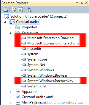
First we need to setup our project. First create your Silverlight project and add one UserControl named "CustomLoader.xaml" in the project. Then we need to create the UI of the UserControl. But before going to that step, we need three assembly references included in the project. the following three DLL references in it:
The first DLL will be useful to create a Circular Arc and the rest of the other two DLLs will be used to create the Triggers. We will discuss more on this later while adding them.

Once you added the DLL references, add the respective XMLNS namespaces in the CustomLoader usercontrol as shown below:

The first xmlns namespace named "ed" will refer the Microsoft.Expression.Drawing.dll assembly and by using this we will create an Arc in the UI. The rest two namespaces from the System.Windows.Interactivity.dll and Microsoft.Expression.Interactions.dll will be useful to create the EventTrigger. Once you are done with this step, we can jump into the UI design.
In this step, we will just create the UI of the loader, where we will have a circular control in the screen. Let's open the usercontrol that we added into the project and replace the LayoutRoot Grid control with a ViewBox control and add a Canvas panel into it. Confused, why we did this!!! Read my previous article then. That will clarify the same.
Now add proper height and width to the Canvas, so that, we can place a symmetric arc control inside it. We will now add one Arc control from the "ed" namespace as shown below and add RenderTransform to it, so that, we can rotate the control easily using the StoryBoard. We will also add a Gradient fill to the control to create the similar look and feel that we shown earlier.
<Viewbox>
<Canvas x:Name="LayoutRoot" Background="White" Height="100" Width="100">
<ed:Arc x:Name="arc" ArcThickness="20" ArcThicknessUnit="Pixel"
EndAngle="360" Height="100" Stretch="None"
StartAngle="0" UseLayoutRounding="False" Width="100"
RenderTransformOrigin="0.5,0.5">
<ed:Arc.RenderTransform>
<CompositeTransform/>
</ed:Arc.RenderTransform>
<ed:Arc.Fill>
<LinearGradientBrush EndPoint="0.5,1" StartPoint="0.5,0">
<GradientStop Color="Black"/>
<GradientStop Color="White" Offset="1"/>
</LinearGradientBrush>
</ed:Arc.Fill>
</ed:Arc>
</Canvas>
</Viewbox>
Make sure that, we can create the same without using the Arc control. In that case, you don't have to add the said assembly. So, what to do in that case? You can create two circles using Ellipse control but that step will be little tough and complex.
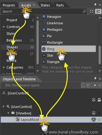
If you are familiar with Expression Blend, you can add the Arc by following the below steps as shown in the screenshot:

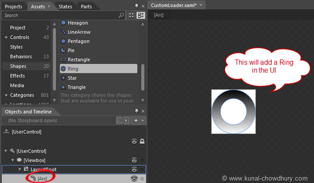
These steps will add the control in the UI as shown below:

This actually create the same XAML code mentioned earlier. Add the RenderTransform properly to the control. Remember that, if you didn't already add the reference in the project. This step will do that for you automatically.
Now time to create the Storyboard for our loader to give proper animation to it. Inside the UserControl.Resources add the Storyboard as shown below:
<UserControl.Resources>
<Storyboard x:Name="LoaderAnimation">
<DoubleAnimationUsingKeyFrames Storyboard.TargetName="arc" RepeatBehavior="Forever"
Storyboard.TargetProperty="(UIElement.RenderTransform).(CompositeTransform.Rotation)">
<EasingDoubleKeyFrame KeyTime="0" Value="0"/>
<EasingDoubleKeyFrame KeyTime="0:0:2" Value="365"/>
</DoubleAnimationUsingKeyFrames>
</Storyboard>
</UserControl.Resources>
This storyboard will be responsible to rotate the control 360 degree for indefinite time. Give a proper name (say "LoaderAnimation" in our case) to the Storyboard.
Once your Storyboard animation is ready, it's time to fire the Storyboard to play. You can do this from the code behind too. But as we said, we will not use any code behind file, hence we will trigger this from the XAML code itself.
Let's use the below code which will trigger the animation once the view loaded:
<i:Interaction.Triggers>
<i:EventTrigger>
<ei:ControlStoryboardAction Storyboard="{StaticResource LoaderAnimation}"/>
</i:EventTrigger>
</i:Interaction.Triggers>
The ControlStoryboardAction behavior will fire the play call to the animation mentioned using the StaticResource.
This is simple step. First add the proper XMLNS namespace of the control in the view and then add the control inside the Grid control or whatever is your preferred location. Our code will look like this:
<UserControl x:Class="CircularLoader.MainPage"
xmlns="http://schemas.microsoft.com/winfx/2006/xaml/presentation"
xmlns:x="http://schemas.microsoft.com/winfx/2006/xaml"
xmlns:CircularLoader="clr-namespace:CircularLoader">
<Grid x:Name="LayoutRoot" Background="White">
<CircularLoader:CustomLoader Height="50" Width="50"/>
</Grid>
</UserControl>
Use this code for your reference. This step finishes the complete design of our control and now time to see it in action.
Build the project and resolve if any error happens. Now run the project and you will see the following UI inside your browser:
That's our control that we created just now. Simple and small steps to create such nice looking circular loader for your application. You can now customize and add other functionalities to it too.
Hope these two articles will help you to create circular loader for your application. You can create many types of circular loader. Once these steps are clear to you, it will be easier for you to implement.
Do you need the complete code? Ok, you can download the complete source code for free from the below mentioned location. Use it for your reference:
CodeProjectThank you for visiting our website!
We value your engagement and would love to hear your thoughts. Don't forget to leave a comment below to share your feedback, opinions, or questions.
We believe in fostering an interactive and inclusive community, and your comments play a crucial role in creating that environment.