Day 2: Working with BusyIndicator of Telerik Silverlight RadControls
Last week I started exploring Telerik RadControls for Silverlight. On Day 1 of exploration, I just gone thru the basic overview of Telerik...
-
Published by Kunal Chowdhury

Last week I started exploring Telerik RadControls for Silverlight. On Day 1 of exploration, I just gone thru the basic overview of Telerik RadControls and installation steps.
In this post, we will explore the BusyIndicator that comes with RadControls. The basic code is similar to what comes with Silverlight by default. The difference which catches the eye is the circular progress bar.
Let's start exploring it and see what are the properties available there and how to start working with this control.
If you don't have RadControls library installed in your PC, download the free trial version from Telerik site. The installation steps are mentioned in this post: Day 1: Working with Telerik Silverlight RadControls.
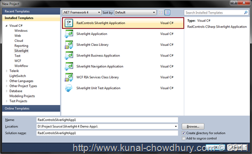
Once your development environment is setup, open your Visual Studio 2010 IDE and click on Create New Project. In the "New Project" dialog Window, select Silverlight from the left panel. This will filter out the Silverlight templates for you.
In the main panel you will see a template called "RadControls Silverlight Application". Select this as the default template for your project, if you want to create a sample project.
In the next step click "Ok". This will ensure that you are creating a web project for hosting your Silverlight application.
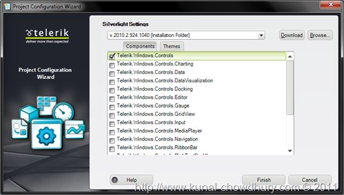
In the third screen (as shown below) will give you option to include various libraries required for your application. Chose the appropriate library assembly that you want to use. Cool thing is that, the dependency libraries will also get selected when you select any assembly from that.
This will create the sample project for you. Build and run the application to check for any error.
Before starting with the next part, you might want to know about the RadBusyIndicator control. Well, Busy indicator is a Silverlight control which you can add in your Silverlight application to show a loading indication to your user while saving some sort of operation in database. Generally it is useful when you calling your WCF Service to store something in server or retrieving some data from server.
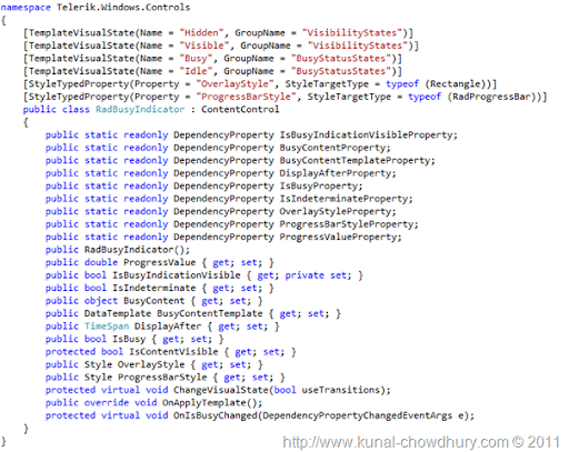
The Rad BusyIndicator has four visual states named as Hidden, Visible, Busy and Idle. It has some dependency properties called:
Have a look into the complete list of the members in RadBusyIndicator here:
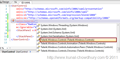
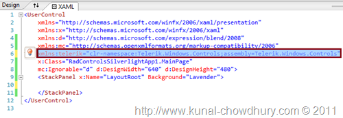
Once your project has been created and successfully built, add the Telerik namespace "Telerik.Windows.Controls" in your XAML page. See the below screenshot for more details:
This will look as below:
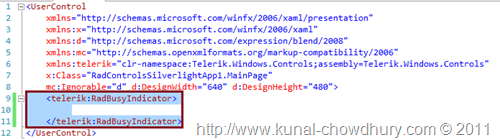
Now add the telerik RadBusyIndicator as the root control of the MainPage. Replace Grid tag with the same. Here is the same:
Now add whatever you want to insert inside it. The content that is present inside the BusyIndicator will became disabled once the indicator enters into busy mode.
For our example, I created the below XAML code:
<UserControl
xmlns="http://schemas.microsoft.com/winfx/2006/xaml/presentation"
xmlns:x="http://schemas.microsoft.com/winfx/2006/xaml"
xmlns:telerik="clr-namespace:Telerik.Windows.Controls;assembly=Telerik.Windows.Controls"
x:Class="RadControlsSilverlightApp1.MainPage" Width="600">
<telerik:RadBusyIndicator x:Name="radBusyIndicator">
<StackPanel Orientation="Vertical" Margin="50">
<TextBlock Text="Working with the Telerik Rad BusyIndicator Control"
FontSize="32" TextAlignment="Center" TextWrapping="Wrap"
FontWeight="Bold" Foreground="Red">
<TextBlock.Effect>
<DropShadowEffect/>
</TextBlock.Effect>
</TextBlock>
<telerik:RadButton Content="Show Busy" HorizontalAlignment="Center"
Width="100" Margin="20"
Click="RadButton_Click"/>
</StackPanel>
</telerik:RadBusyIndicator>
</UserControl>
We will not create a stunning UI for this sample project. Hence, we are going with a TextBlock and a Button control. Once we click on the button, the rad busy indicator will enter into the busy mode.
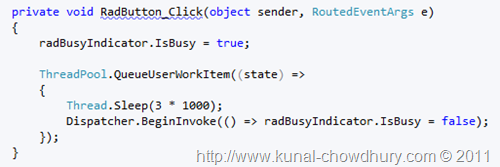
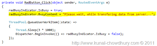
As the UI is ready, we need to write a sample code to test the BusyIndicator. To do this, add the click event of the Button and write the following code in the event implementation:
To start the busy indicator, just set IsBusy to true and set it to false, when you want to close it.
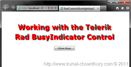
Let's run our sample application. You will see the following screen inside your browser window:
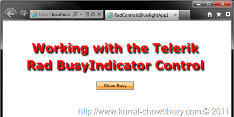
Click on the "Show Busy" button to load the busy indicator.
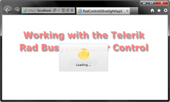
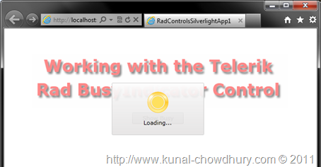
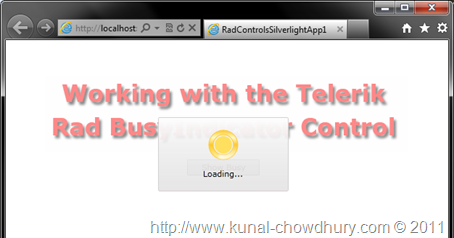
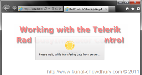
You will now see that the busy indicator loaded into the UI and disabled the visible area which was surrounded by the RadBusyIndicator control. The progress bar that loads into the UI has a circular progress control. Check it here:
The progress bar will move in circular direction while in busy mode.
Now, do you want to change the text? By default, it shows "Loading..." as the content. You can change it to some other strings also. Have a look:
To do it, just set the BusyContent property of the indicator control. That will do the trick for you. You can either set it in the XAML or set in the code behind before doing the call. Let's have a look of it here:
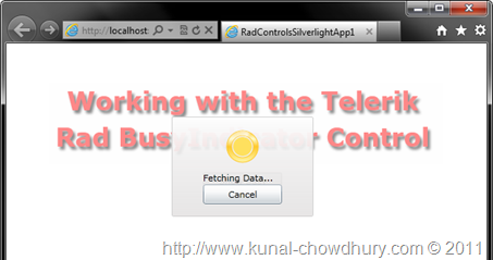
You might also ask, is it possible to put a cancel button there too? Yes, why not!!! You can set any nos. of control there instead of just the simple text. So, how to do this?
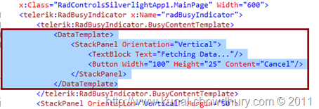
To do it, edit the Busy Indicator's BusyContentTemplate and modify the template there. You can bind any data there too. Have a look into the following XAML code for more details:
Hope, this information will help you when you work with the Silverlight BusyIndicator, mainly the control that comes with the Telerik RadControls library. Enjoy reading my other articles too. I will continue for sometime exploring the telerik rad controls from now and will try to post them for you, so that, you will get some help from there while working with them.
Don't forget to leave your feedback. Suggestions are always welcome.