
As a WPDev, sometime we want to show a callout type information box or a notification popup within the Windows Phone application to the end user. Building such type of control needs a lot of effort before using that in an application.
Infragistics came up with their own control to help the Windows Phone developers to save their effort building it from the scratch. Today we are going to discuss it here with step-by-step code snippet.
Infragistics NetAdvantage library for Windows Phone provides a default control named InfoBox which you can use in your Windows Phone 7 and/or Windows Phone 8 applications to provide some information or notification to the user within the application window. Before going in depth, let me tell you in advance that, this control library is not free and before using it in your application, you have to purchase that product. Also, you can try this library by installing the Free Evaluation version by following this link: http://www.infragistics.com/products/windows-phone/downloads.
I am assuming that, you already have a license code of Infragistics Windows Phone library or you want to know more about the control before actually using the product. So, let’s go further discussing the topic here.
Know about the API
 Before going further on this, you should know a bit about the API first. Infragistics “XamInfoBox” control is present under the “Infragistics.Controls.Interactions” namespace and represents a control that can be used to show information pointers. Using this control, you can either show some information or notification to the end user. You can also use this control to show a settings like page in your Windows Phone application.
Infragistics.Controls.Interactions.XamInfoBox exposes new dependency properties to handle various control styles provided by the end user. You can use the “Content” property to set the inner content/text and the “IsOpen” property to show/hide the InfoBox control in the user’s screen.
Here is the meta data of the control, for your reference:
namespace Infragistics.Controls.Interactions
{
public class XamInfoBox : Control
{
public object Content { get; set; }
public DataTemplate ContentTemplate { get; set; }
public bool IsOpen { get; set; }
public FrameworkElement RelativeToElement { get; set; }
public Placement RelativeToElementPlacement { get; set; }
public double PointerBaseLength { get; set; }
public double PointerLength { get; set; }
public double PointerOffset { get; set; }
public bool IsClosedOnOutsideTap { get; set; }
public bool IsClosedOnBackButton { get; set; }
public Brush PointerBackground { get; set; }
public Brush PointerBorderBrush { get; set; }
public double PointerBorderThickness { get; set; }
public double CornerRadius { get; set; }
public PointerShape PointerShape { get; set; }
public double DisconnectedPointerOffset { get; set; }
public bool UseOpenAnimation { get; set; }
public bool UseCloseAnimation { get; set; }
public Thickness FloatingMargin { get; set; }
public bool ShowAgain { get; set; }
public bool ForceShowAgain { get; set; }
public string UniqueKey { get; set; }
}
}
Though the properties are self explanatory by their name, but here is the list of them with a brief description of each property of the control:
| Property Name |
Property Description |
| Content |
Gets or sets the content of the InfoBox |
| ContentTemplate |
Gets or sets the data template that is used to display the content of the InfoBox |
| IsOpen |
Gets or sets a value indicating whether the InfoBox is open |
| RelativeToElement |
Configures the positioning of the xamInfoBox to be relative to the UI element of the screen to which the name relativeElement has been assigned. |
| RelativeToElementPlacement |
Places the info box beneath the UI element to which it points if space permits |
| PointerBaseLength |
Gets or sets the length of the pointer base |
| PointerLength |
Gets or sets desired length of the pointer |
| PointerOffset |
Gets or sets the offset between the pointer and the RelativeToElement |
| IsClosedOnOutsideTap |
Gets or sets a value indicating whether the InfoBox is closed when the user tap outside |
| IsClosedOnBackButton |
Gets or sets a value indicating whether the InfoBox is closed when the back button is pressed |
| PointerBackground |
Gets or sets the Brush that specifies how to paint the InfoBox pointer |
| PointerBorderBrush |
Gets or sets the Brush that specifies how the InfoBox pointer outline is painted |
| PointerBorderThickness |
Gets or sets the width of the InfoBox pointer outline |
| CornerRadius |
Gets or sets the radius for the corners of the InfoBox |
| PointerShape |
Configures one of the available pointers to be displayed |
| DisconnectedPointerOffset |
Configures the offset of the pointer from the callout |
| UseOpenAnimation |
Gets or sets a value indicating whether the animation will be shown or not, when the InfoBox is open |
| FloatingMargin |
Gets or sets margin values (left,top,right,bottom) restricting position of the control on the screen |
| ShowAgain |
Gets or sets the ShowAgain property value. When true, the window will be displayed the next time it is requested |
| ForceShowAgain |
Gets or set the ForceShowAgain property value. When true, the window will be displayed the next time it is requested regardless the ShowAgain property value |
| UniqueKey |
Gets or sets the UniqueKey property value, used to identify a specific ShowAgain user response |
I hope that the API details already gave you some basic idea of the control uses. Let us jump to the next point and have some hands-on with this control. Follow the steps and code snippet properly to implement your first Infragistics XamInfoBox control in your Windows Phone application.
Hands-on with the Control and Code

First of all, you need to add the proper assembly reference in your Windows Phone application project. If you are building Windows Phone 7 application (as target framework), add the assembly reference named “InfragisticsWP7.Controls.Interactions.XamInfoBox.v12.2” in your project. In this context remember that, the “v12.2” might get change based on the control library version that you are using. For your reference, attached a sample screenshot here.
The next step that you have to do is adding the xmlns namespace in your XAML file. If you don’t want to add the control in XAML page and want to use it directly from code behind, you can skip this step but as we are demonstrating the integration and API uses from XAML page, let’s go with this and add the below xmlns namespace to the root of the file:
xmlns:ig="clr-namespace:Infragistics.Controls.Interactions;assembly=InfragisticsWP7.Controls.Interactions.XamInfoBox.v12.2"
You can see the sample code in the below screenshot:

Before adding the XamInfoBox control in the page, you will need a parent base to refer the position of the control. If you don’t declare and reference it, the control will be placed at the top left corner of the screen. So, let’s add a Border control in the page as shown in the below screenshot (you can chose any control here):

Now, you need to define the actual control in the page and assign proper values to the respective dependency properties as described earlier in the table. You must need to refer the relative parent element as base (in this case “borderBase”). This will make sure that the control loads in the proper position where you want to show the Info Box.
The “RelativeToElementPosition” property will make sure to open the info box at the top, left, right, bottom or the position that you want to display the same. Like this, set all the properties to give the UI a better look. At the end, when you want to show the InfoBox control in the screen, just set the “IsOpen=True” and when you want to hide it, set the said property to “False”.
Here is the complete code that we used to demonstrate the use of this control:
<Border x:Name="borderBase"
HorizontalAlignment="Center" VerticalAlignment="Top"
Background="Green"
Width="200" Tap="OnBorderBaseTapped">
<TextBlock Text="Tap here" TextAlignment="Center" Margin="5"/>
</Border>
<ig:XamInfoBox x:Name="infoBoxControl"
RelativeToElement="{Binding ElementName=borderBase}"
RelativeToElementPlacement="Top"
IsClosedOnOutsideTap="False"
PointerLength="30"
PointerBaseLength="50"
PointerOffset="0"
PointerShape="CurlyPointer"
CornerRadius="10">
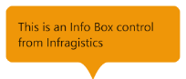
<TextBlock Text="This is an Info Box control from Infragistics"
Width="250" Margin="10" TextWrapping="Wrap"/>
</ig:XamInfoBox>
I hope this post will help you to understand more about the API, it’s properties and the way to integrate it in your Windows Phone application to provide a better UI experience to the end user. Once you are clear with the code implementation, you will be able to customize it further and better use the control in many other places for a rich interactive user experience.


If you have further queries, let me know and I will try to answer you as soon as I can. Further, connect with me on Twitter, Facebook and Google+ for any technical discussion and updates. Don’t forget to subscribe to my blog’s RSS feed and email newsletter as those will provide you all technical article updates delivered directly to your inbox.
")
")


 Before going further on this, you should know a bit about the API first. Infragistics “XamInfoBox” control is present under the “Infragistics.Controls.Interactions” namespace and represents a control that can be used to show information pointers. Using this control, you can either show some information or notification to the end user. You can also use this control to show a settings like page in your Windows Phone application.


